Citi Retail Services: Credit Cards
The goal of this UX case study for Citi Retail Services is to redesign the digital experience to improve user satisfaction, increase engagement, and drive better utilization of services like account management and rewards redemption.


Problem Statement
Citi Retail Services, a major player in retail credit card services, faced declining user engagement and customer dissatisfaction due to outdated and unintuitive digital experiences.
Key issues included:
-
Complex Navigation: Customers found it challenging to locate critical account information.
-
Inefficient Payment Flow: The payment process was long and prone to user errors.
-
Underutilized Rewards: Customers were unaware of or found accessing and redeeming rewards difficult.
-
Mobile Inconsistency: The mobile app did not provide a seamless experience compared to the web platform.
Target Audience:
-
Tech-savvy individuals aged 25-45
-
User Applying for Credit cards and shopping for best rewards options
-
Customers with Accessibility needs requiring ADA-compliant designs
User Research
Methods:
-
Conducted 7 user Interviews with Customers who had abandoned their applications
-
Performed Competitive Analysis of other Financial Institutions
Key Insight:
-
67% of users abandoned the application after the third step.
-
45% of users found the interface unclear, especially the small screens
-
Lack of Progress Indicators caused frustration, making the process feel endless.

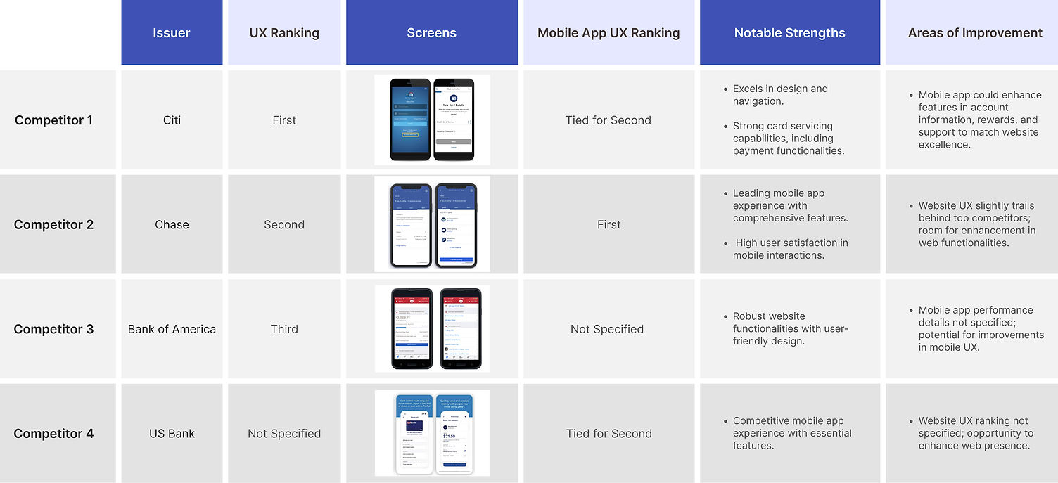
Competitive Analysis
User experience rankings are based on evaluations of design, functionality, and usability as of February 2024
.jpg)
Interface Design
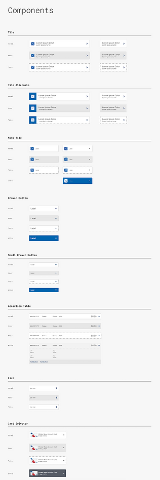
A variety of UI components were explored to ensure optimal layout with fewer blocks towards form completion.
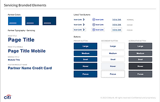
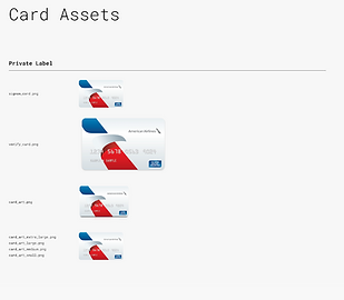
Right before creating high-fidelity wireframes and prototypes, I wanted to identify Citi mobile app with the UI kit that contained the logo, color palette, typography, icons, input fields, section controls, and buttons.
This is our branding kit for the American Airlines application form.
- Typography
-Color
-Form Elements



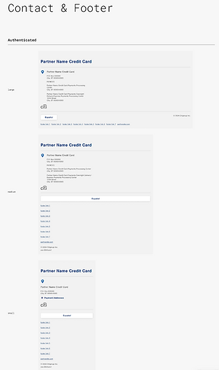

Proposed Design - Boxed Example Page
Just an idea of screen how it will look like in hi-Fidelity Design
After identifying the UI kit we naturally flew into the process of filling out the wireframes with the elements of the design system and coming up with the complete visual design.


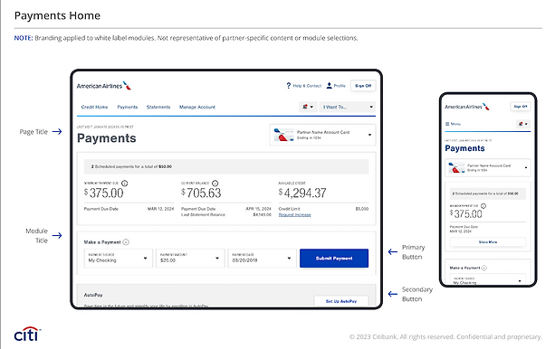
Credit Home
-
Serves as a centralized dashboard with an overview of account balances, payments, credit limits, and due dates.
-
Modular design provides users with quick access to specific actions, such as submitting payments or managing accounts.
-
Prominent placement of actionable buttons, like "Submit Payment," reduces the cognitive load for users.

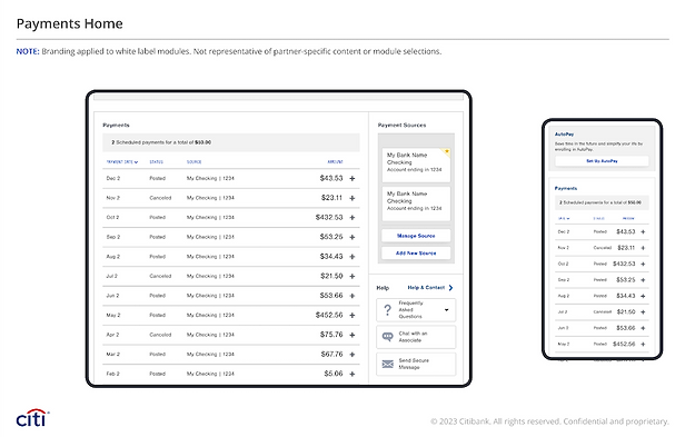
Make Payment
-
Displays options for payment sources, payment amounts, and payment dates.
-
Includes primary and secondary action buttons, such as "Submit Payment" and "Cancel," for user guidance.
-
Highlights critical payment information such as due dates, minimum payment amounts, and current balances, ensuring transparency and ease of use.


Recommendations
Introduce Guided Tutorials:
Include interactive guides or tooltips for first-time users, highlighting key functionalities and explaining complex features like autopay setup
Implement Real:
Time Feedback : Use animations, progress bars, or confirmation dialogues to provide immediate feedback during payment processing.


Enhance Mobile Experience:
-
Introduce swipe gestures for quick actions, such as viewing or canceling scheduled payments.
-
Optimize layouts to ensure all interactive elements are easily tappable, even on smaller devices.
Streamline Dashboard Design :
Include a "Quick Actions" section with shortcuts for common tasks like making payments or viewing statements.
Improve Error Handling:
Provide actionable error messages with detailed explanations and links to relevant help articles
Add Visual Insights: Provide comparative analytics, such as monthly spending trends, to enable informed decision-making.


Impact
-
User-Friendly & Accessible (30%) – Ensures a seamless experience with strong visual consistency.
-
Digital Innovation (20%) – Aligns with modern user expectations through clarity and action-oriented design.
-
Enhancement Opportunities (25%) – Improving mobile optimization, customizable dashboards, and advanced visualizations.
-
Industry Leadership Potential (10%) – Strengthening Citi’s position with a superior digital payment experience.
-
Strategic UX Roadmap (10%) – Provides actionable insights to elevate functionality and user satisfaction.
