


Introduction
I build this app because I often hear my single friends complain about online dating. I wanted to see if I can build an app that can diminish the stigma of online dating and possibly improved their experience.

My role
-
I was the only UX designer and UX researcher in this project.
-
I was responsible for conducting all the field research and designing the mobile app.
Tools
Figma, Google Form, Procreate
The problem
-
The dating culture in our era has become a hookup culture without finding a real connection.
-
Most of the problems with online dating are ghosting, cat-fishing, and singles who are only looking for a hook-up.
The goal
To build a dating app that will reduce false persona, ghosting, cat-fishing, and people who are not looking for a serious relationship.
Design Process
Survey
I used a survey so I can conduct qualitative and quantitative research.
The main purpose is to understand the needs, wants, and problems of dating app users.
The survey was a combination of open-ended, closed-ended, and multiple-choice questions.
-
Have you ever used a dating app? If so, what did you like about it? Or what did you dislike about it?
-
What is one thing you wish they had on the dating app?
-
What do you think is lacking in dating apps? How can it change?
-
Check all that you dislike about dating apps.
Why You don't like online Dating?

Surveys and interviews were conducted to understand dating app user's feelings and thoughts about online dating.
Interview
Via Zoom or Facetime
After gathering the information from the survey, I then proceeded to do one-on-one interviews with people who used dating apps.
I wanted to understand their pain points and shifted my focus to the whole user.
Interviews were conducted with open-ended questions such as:
-
“Tell me about a time when you experienced ghosting, cat-fishing, or came across people who lied about who they are?
-
"What do you think about rating your matches in the app?"
-
“Do you think people on dating apps are looking for something serious?”
-
"What features do you think will help with ghosting, catfishing, and people being inauthentic?

Competitive Analysis
Users were also asked about their favorite app and the reasons they love the app.
They were also asked about which functions they would like to see added.

Bumble - "Being able to initiate the conversation"
Tinder, Badoo- "Lot of users in my region"
Hinge and Bumble- "More quality people"
Tinder- "The app has a bad hook-up reputation"
Define
Pain Points
Pain Points, Personas, and Empathy Map
To define the user's problem based on my research I used pain points.
To find solutions and to have a general overview of the problems users are facing while dating online, I created users' pain points and personas.

Dan
"Some pictures are deceiving because they look different in person"

Ann
"No spontaneous, every conversation is the same like on the interview, boring."

Kev
"People aren't being authentic and there are a lot of cat-fished"

Kim
"All I find are weirdos and hookups"
Personas
In order to start personifying my users, I created personas to learned who my users are, what experienced they have on dating apps, what are their pain points, and what goals they have regarding dating.

"Some people don't seem genuine and maybe they are but you don't know their intention"
Never Married
Dave, 46, a never-married, graphic designer, is looking for the one.
He never really tried dating apps because he often meets people through his network of friends.
He is very active socially and he is always meeting people. When he tried dating apps, he felt people didn't seem genuine and sincere so he stopped using them.
Currently, he has a hard time finding people who are not related to his group of friends so he would like to give online dating a chance. He hopes that there is an app that filters people who are serious about finding someone.

"Most people just want to hook up and after meeting with them they just disappeared like a ghost"
Busy Single Mom
Jezy, 31, a single Mom, nurse, has a very unpredictable schedule that keeps her from meeting people in a social setting.
After sacrificing her life for her daughter she now feels that it's time to find real love.
However, she is frustrated because after she gets to know someone they often ghosted her. She also feels that most men aren't serious about finding someone. She wishes there is a rating system in the app so people will be more responsible with their intention and how to treat a person.

"I lost interest in the app because people are not being real so I don't trust the people in the app"
Widowed
Remi, 69, retired, widowed for 10 years, and has a traditional outlook on dating.
Though she doesn't want to remarry again she is still looking for someone serious with whom she can spend the rest of her life with. She would also like to find someone who has the same hobbies and lifestyle like her.
However, she is frustrated because most people aren't the same person when she meets them.
She hopes that there is a dating app that can minimize people who aren't being real.
Ideate
"How Might We?", and Brainstorming ideas
After figuring out the users’ pain points, I started the ideation process so I can come up with as many ideas as possible this includes using competitive analysis, "How might we", and brainstorming.

Defining the problem
In order to translate the problems into opportunities for design, I wanted to use "How might we" (HMW) and Point of View (POV) to get my creativity flowing.
Empathy Map
To truly understand my user's goals, feelings, and thoughts I used an empathy map to organized my user's insight.

Brainstorming Ideas
As I finally defined the four major problems, I then brainstormed ideas.

Solution
Below are solutions that I gathered based on the data collected from the users.

Rating System
One of the solutions to implementing accountability in Cupid is to rate each match after the date with a series of questions that are based solely on their profile.

Filter System
One of the solutions to implementing accountability in Cupid is to rate each match after the date with a series of questions that are based solely on their profile.

Updating Video/ Pictures
Uploading an introduction video that is created only for the app will lessen fake profiles or catfishing

Questioners
Questioners for each match will help with keeping each match interesting and so they have a topic to discuss rather than just a "Hello"
Build & Design
User Flow, Paper Wireframes, and Digital Wireframes
To build and design the app I first outline the task the user has to take by creating user flow.
I then proceed to make the paper wireframe. Later, I also created a digital wireframe to test the mobile app.
User flow
To build the app, I first wanted to understand and outline the users’ tasks from start to finish.
.png)
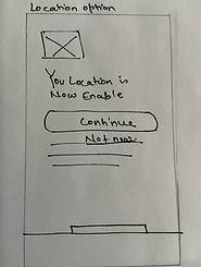
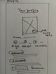
Sketches Wireframes
My first step was using paper wireframes to simply get ideas as fast as I could. I then turned those ideas into digital wireframes in order to get the structure right and eventually conduct my first usability studies.


Digital Wireframes
I created a digital wireframe in order to make a low fidelity prototype so I can conduct usability testing to see if the feature added resolves the user's pain points before I add the final visual design.
Test
Low-Fidelity Prototype, Usability Testing, and High Fidelity Prototype
Conducted two usability studies with the mobile App to validate my design and determine any pain points in the design.
Low-Fidelity Prototype
I first used a Low-fidelity Prototype in the first usability studies I conducted in order to recognize if the features I added solved the users’ pain points and if there are any additional features that should be included according to the users’ needs before proceeding to the final design. I conducted unmoderated studies by asking them a lot of open-ended questions about the app.
I also asked what features they want to add to the app.

Final Usability Testing
The second usability testing I have done is using the High-Fidelity Prototype so I can assess how easy it is for participants to complete each task in the design and how real users interact with my design.
In these studies, I used moderated usability studies so I can also get more feedback on the design.

Most of them suggested asking more detailed questions so I added personal questions that are required to be answered by their matches.
After getting feedback from my users, one of the major concerns is how the rating system will work without being biased.
In order to address this concern, I created questions based only on their dating experience and not something that degrades a person.
I also created a place where they can give feedback if they feel their rating is inaccurate.


75%
They will use the App

90%
The app is easy to use

25%
App unnecessarily complex

70%
App is well-integrated
"Awkward but could help with catfish or discourage people from using the app"
Feedback on the rating system and the video
Visual Design
Light Mode, Dark mode and final wireframes
Logo
Fonts
Dosis
Crimson Text
Color code

#DD627C


#E36896
#DA66B2
#C660E1

#EF9DCA

#32373B

#45484B
Brand Personality
Cupid is designed for real connection and a dating app for people serious about finding the love of their life. Just real life, real connection, and real accountability.
Brand Attributes
Trustworthy, Real connection, and accountable.
Colors
I chose the pink color palette because it represents love, friendship, affection, and harmony.
Icons
Simple icons were also used to convey and provide shortcuts to the app.

Final Thoughts
What have I learned from this project?
-
This project was a great experience for me, especially conducting research. However, one of the major problems.
-
I encounter is how will the app be different from the other popular dating apps and how will the users rate matches without them being biased.
-
I was also afraid that I won’t be able to solve the accountability issues in the dating app but by talking to my interviewers and doing two usability testing and redesigning the app I was able to solve the user's pain points.
What next?
The app is a project I did to gain more practice so I am not sure if it will ever be in the developing stage.
Hopefully, maybe shortly, I will be able to revisit the app.